Just the name sounds impressive: Call to Action. It’s assertive. It’s direct and specific. Best of all, it tells visitors what to do at a point where they’re staring at a screen with a seemingly infinite number of paths they can explore. But what is a CTA? And how can you create a CTA that will successfully guide your visitors towards the goal of purchasing your product or services?
Though a call to action may seem like a relatively simple part of your website, especially when compared to longer forms like blogs, you still need to carefully consider the elements you include in your CTA. Let’s dissect the anatomy of a call to action, as well as the “whys” and “hows” that will help you gain the conversions you need.
What Is a Call to Action?
As the name implies, a Call to Action is content specifically designed to engage the audience and encourage them to take a particular action. This can be anything from an obvious “Buy Now!” statement, to information that guides new visitors towards a lead magnet.
Many people are familiar with CTAs on squeeze pages. Think about some of the squeeze pages you’ve viewed recently. “Sign up now for 10% off your first order”, “Subscribe to our text alert program for extra deals and savings”.
To be as effective as possible, you should include one on every page of your website. A call to action can be easily incorporated anywhere. On your blog, you can point readers to a related article – “Click here to read more about…” You can implant a social media CTA nearly anywhere, too: “Follow us on Instagram for more photos!” The goal is to provide your reader with a very obvious action with an equally clear objective. If they do this, they’ll receive that.
What Are the Elements of a Successful CTA?
Creating the perfect call to action can be a bit of an art. First, you need to decide what you want to accomplish with your statement. This ensures that your CTA is fully focused on an action and result. To do so, you need to make sure you are direct, compelling, and clear in a very little amount of space.
Action Phrases
The simplest way to do that is through action phrases. These terms give clear direction to the reader about the step they’re about to take. A few examples include:
- Sign up
- Follow
- Click here for
- Subscribe
- Buy
- Order
- Register
- Call
Reading this list, you can probably think of a few examples of call to action statements you’ve seen recently. Think about the overall message of those CTAs. Did you feel confident about what was required, and what you would receive in return? Did you hesitate before completing the action, and if so, why?
Urgency
The next important element in a CTA is the sense of urgency. It’s much easier for a visitor to disregard a call to action if they feel they can come back to it at any time. Consider the following CTAs:
Register for our webinar and receive a free copy of our eBook.
OR
Register for our limited-seat webinar by May 15th to receive a copy of our eBook, absolutely free.
The first statement is clear enough. If you sign up for a webinar, you receive a free book. That sounds compelling, but maybe you’ll look around the site first, bookmark it for later, or jot the site down on a sticky note. There’s no reason to deal with it right now.
In the second CTA, you have a deadline and a virtual seat limitation for completion. You have the option to wait to register, of course, but if you don’t do so by a certain date, you might lose out on the free offer. When visitors feel they must complete an action by a specific time, or by specific reasons (limited-seat webinar) they’ll be more likely to take advantage of this exclusive deal.
Read also: How to Use Scarcity Marketing the Right Way
Another important element to keep in consideration
The second statement includes another important piece of a successful CTA: a sense that there’s no obligation or risk. You can sign up for the exclusive online course at ANY time. The eBook is absolutely free. There’s an obvious and immediate benefit to doing the requested action right now, but no risk or danger if you prefer to take your time to learn more. In the customers’ eyes, it’s a win-win situation!
The Secondary Call To Action
A truly great CTA will include an “escape hatch” for visitors who aren’t quite ready for that specific step. Think back to a squeeze page you’ve seen lately. If you didn’t sign up, register, enroll, or buy, how did you move on? Customers need a secondary CTA: a very clear alternative to the main activity.
Think from the point of view of a customer. What if they find themselves on a landing page, ready to buy, but first, they have to jump through several CTA hoops asking them to sign up for your newsletter, enroll in your course, or read the latest article. They’re going to lose momentum on that purchase, and find another way to get what they need. Allow visitors to quickly and easily opt out of CTAs so they can complete the action that brought them to your site.
Earlier, we said it’s important to place a CTA on all pages of your site, and this scenario is a perfect example of why that’s important. Don’t prevent customers from taking action by limiting their ability to find that squeeze page or lead magnet. Most website visitors know they should look for the button that says “Check out” or “Sign up now,” so make sure that CTA is displayed clearly wherever it applies.
Recap: use this for a high converting CTA
A successful CTA starts with action language. It provides a very clear description of the activity required, so that anyone reading it is well aware of what they need to do next. The CTA should also explain why they want to take that action. They will know what they will receive in exchange for their compliance.
If there is no clear benefit to entering your email address, following on Facebook, or clicking here, then few people will feel it necessary to complete that step. To encourage them further, consider adding a deadline. This will add urgency to the situation, compelling the visitor to take the step right now, as opposed to waiting. That being said, perhaps this isn’t the right time for that step, depending on where the visitor is in the sales funnel. Make sure there’s a clear secondary option available. The key verb is “encourage”, not “force!”.
A call to action is just what it sounds like: a clear, assertive direction that guides the visitors to your website through the sales funnel. But if your CTAs are not written with the necessary elements, those visitors may become easily frustrated or lost. Clarity in your content will help keep these visitors engaged, leading them to their first purchase and a future as a lifetime customer.
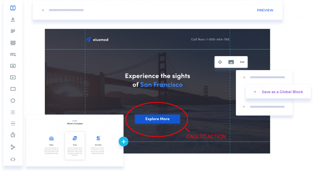
CHECK OUT THE LANDING PAGES TOOL
THAT INCREASED BY 114% MY LEADS CONVERSION RATE
CLICK THE BUTTON BELOW TO GET:
| 200+ Pre-Built Converting Templates | SEO Friendly Pages |
| Easy to Use Page Builder | No High-Tech Skills Needed |
| A/B Testing | Integrations (Autoresponders ,CRM) |
| No Limits (Leads, Publishings…) | Free up to 500 email subscribers |
| 99,9% Uptime | GDPR Compliant |
| Popups & Alert Bars | 14-Days Free Trial |